Design Tokens
Synonyms: style properties, design variables, design constants, atoms
Design tokens are the platform-agnostic way to define design decisions, and are the main input for Style Dictionary.
A design token is transformed for use in different platforms, languages, and contexts.
A simple example is color. A color can be represented in many ways, all of these are the same color: #ffffff, rgb(255,255,255), hsl(0,0,1).
A collection of design tokens which are organized in a nested object make the Style Dictionary. Here is an example of design tokens written for Style Dictionary:
{ "colors": { "font": { "base": { "value": "#111111", "type": "color" }, "secondary": { "value": "#333333", "type": "color" }, "tertiary": { "value": "#666666", "type": "color" }, "inverse": { "base": { "value": "#ffffff", "type": "color" } } } }}Any node in the object that has a value attribute on it is a design token. In this example there are 4 style design tokens: color.font.base, color.font.secondary, color.font.tertiary, and color.font.inverse.base.
Using DTCG format that would look like:
{ "colors": { "$type": "color", "font": { "base": { "$value": "#111111" }, "secondary": { "$value": "#333333" }, "tertiary": { "$value": "#666666" }, "inverse": { "base": { "$value": "#ffffff" } } } }}From this point on, we are assuming the old Style Dictionary format, this is a disclaimer that some of this will be in slight contradiction with the DTCG spec, e.g. how metadata is handled.
Design token attributes
For any design tokens you wish to output, the “value” attribute is required. This provides the data that will be used throughout the build process (and ultimately used for styling in your deliverables). You can optionally include any custom attributes you would like (e.g. “comment” with a string or “metadata” as an object with its own attributes).
| Property | Type | Description |
|---|---|---|
| value | Any | The value of the design token. This can be any type of data, a hex string, an integer, a file path to a file, even an object or array. |
| comment | String (optional) | The comment attribute will show up in a code comment in output files if the format supports it. |
| themeable | Boolean (optional) | This is used in formats that support override-able or themable values like the !default flag in Sass. |
| name | String (optional) | Usually the name for a design token is generated with a name transform, but you can write your own if you choose. By default Style Dictionary will add a default name which is the key of the design token object. |
| attributes | Object (optional) | Extra information about the design token you want to include. Attribute transforms will modify this object so be careful |
You can add any attributes or data you want in a design token and Style Dictionary will pass it along to transforms and formats. For example, you could add a deprecated flag like in this example. Other things you can do is add documentation information about each design token or information about color contrast.
Default design token metadata
Style Dictionary adds some default metadata on each design token that helps with transforms and formats. Here is what Style Dictionary adds onto each design token:
| Property | Type | Description |
|---|---|---|
| name | String | A default name of the design token that is set to the key of the design token. This is only added if you do not provide one. |
| path | Array[String] | The object path of the design token. color: { background: { primary: { value: "#fff" } } } will have a path of ['color','background', 'primary']. |
| original | Object | A pristine copy of the original design token object. This is to make sure transforms and formats always have the unmodified version of the original design token. |
| filePath | String | The file path of the file the token is defined in. This file path is derived from the source or include file path arrays defined in the configuration. |
| isSource | Boolean | If the token is from a file defined in the source array as opposed to include in the configuration. |
Given this configuration:
{ source: ['tokens/**/*.json'], //...}This design token:
{ color: { background: { primary: { value: '#fff' }, }, },}becomes:
{ color: { background: { primary: { name: 'primary', value: '#fff', path: ['color', 'background', 'primary'], original: { value: '#fff', }, filePath: 'tokens/color/background.json', isSource: true, }, }, },}Referencing / Aliasing
You can reference (alias) existing values by using the dot-notation object path (the fully articulated design token name) in curly brackets. Note that this only applies to values; referencing a non-value design token will cause unexpected results in your output.
{ "size": { "font": { "small": { "value": "10" }, "medium": { "value": "16" }, "large": { "value": "24" }, "base": { "value": "{size.font.medium}" } } }}See more in the advanced referencing-aliasing example.
Defining design tokens
Design token files can included inline in the configuration, or be written in separate files. Style Dictionary supports these languages for design token files:
- JSON
- JSONC
- JSON5
- ES Modules
- Potentially any language with custom parsers
Tokens can be defined inline in the Style Dictionary configuration, or in files. You can add a tokens object to your Style Dictionary configuration like this:
export default { tokens: { color: { background: { primary: { value: '#fff' }, }, }, }, platforms: { //... },};Generally you will have too many design tokens to include them all inline, so you can separate them out into their own files. You can tell Style Dictionary where to find your design token files with the source and include attributes in the configuration like this:
export default { include: [ // you can list singular files: `node_modules/my-other-style-dictionary/tokens.json`, ], source: [ // or use file path [globs](https://www.npmjs.com/package/glob) // this says grab all files in the tokens directory with a .json extension `tokens/**/*.json`, ], // ...};You can organize your design token files in any way as long as you can tell Style Dictionary where to find them. The directory and file structure of design token files does not have any effect on the object structure of the tokens because Style Dictionary does a deep merge on all design token files. Separating tokens into files and folders is to make the authoring experience cleaner and more flexible.
Collision warnings
Style Dictionary takes all the files it finds in the include and source arrays and performs a deep merge on them. It will first add files in the include array, in order, and then the source array in order. Later files will take precedence. For example if you defined 2 source files like this:
export default { source: [`tokens.json`, `tokens2.json`],};{ color: { background: { primary: { value: '#fff' }, secondary: { value: '#ccc' }, }, },}{ color: { background: { primary: { value: '#eee' }, tertiary: { value: '#999' }, }, },}The resulting merged dictionary would be:
{ color: { background: { primary: { value: '#eee' }, secondary: { value: '#ccc' }, tertiary: { value: '#999' }, }, },}This example would show a warning in the console that you have a collision at color.background.primary because 2 source files defined the same design token. A file in source overriding a file in include will not show a warning because the intent is that you include files you want to potentially override. For example, if you had multiple brands and you wanted to share a default theme, you could include the default theme and then override certain parts.
ES Modules
One way to write your design token files is to write them in Javascript rather than JSON. The only requirement for writing your source files in Javascript is to use an ES Module containing a default export of a plain object. For example:
export default { color: { base: { red: { value: '#ff0000' }, }, },};is equivalent to this JSON file:
{ "color": { "base": { "red": { "value": "#ff0000" } } }}You might prefer authoring your design token files in Javascript because it can be a bit more friendly to read and write (don’t have to quote keys, can leave dangling commas, etc.). Writing your design token files as Javascript gives you more freedom to do complex things like generating many tokens based on code:
import Color from 'tinycolor2';
const baseColors = {  red: { h: 4, s: 62, v: 90 },  purple: { h: 262, s: 47, v: 65 },  blue: { h: 206, s: 70, v: 85 },  teal: { h: 178, s: 75, v: 80 },  green: { h: 119, s: 47, v: 73 },  yellow: { h: 45, s: 70, v: 95 },  orange: { h: 28, s: 76, v: 98 },  grey: { h: 240, s: 14, v: 35 },};
// Use a reduce function to take the array of keys in baseColor// and map them to an object with the same keys.export default Object.keys(baseColors).reduce((ret, color) => {  return Object.assign({}, ret, {    [color]: {      // generate the shades/tints for each color      20: { value: Color(baseColors[color]).lighten(30).toString() },      40: { value: Color(baseColors[color]).lighten(25).toString() },      60: { value: Color(baseColors[color]).lighten(20).toString() },      80: { value: Color(baseColors[color]).lighten(10).toString() },      100: { value: baseColors[color] },      120: { value: Color(baseColors[color]).darken(10).toString() },      140: { value: Color(baseColors[color]).darken(20).toString() },    },  });}, {});
Take a look at the this example if you want to see a more in-depth example of using JavaScript files as input.
Custom file parsers
You can define custom parsers to parse your source files. This allows you to author your design token files in other languages like YAML. Custom parsers run on certain input files based on a file path pattern regular expression (similar to how Webpack loaders work). The parser function gets the contents of the file and is expected to return an object of the data of that file for Style Dictionary to merge with the other input file data.
import StyleDictionary from 'style-dictionary';
StyleDictionary.registerParser({  pattern: /.json$/,  parse: ({ contents, filePath }) => {    return JSON.parse(contents);  },});
For more information, read the parsers docs.
Here is a complete custom file parser example
Category / Type / Item
This structure is not required. This is just one example of how to structure your design tokens.
Design tokens are organized into a hierarchical tree structure with ‘category’ defining the primitive nature of the design token. For example, we have the color category and every design token underneath is always a color. As you proceed down the tree, you get more specific about what that color is. Is it a background color, a text color, or a border color? What kind of text color is it? You get the point. It’s like the animal kingdom classification:
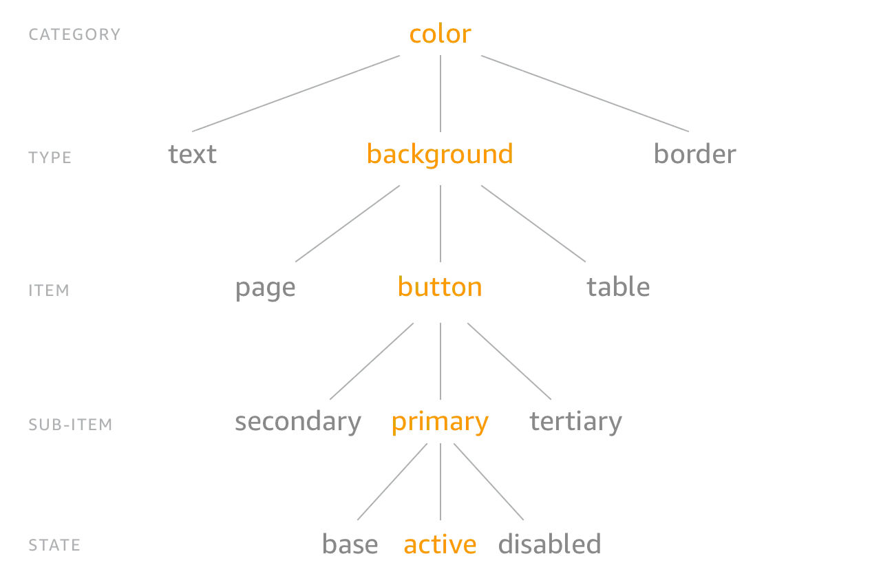
Now you can structure your tokens in a nested object like this:
{ "size": { "font": { "base": { "value": "16" }, "large": { "value": "20" } } }}The CTI is implicit in the structure, the category is ‘size’ and the type is ‘font’, and there are 2 tokens ‘base’ and ‘large’.
Structuring design tokens in this manner gives us consistent naming and accessing of these tokens. You don’t need to remember if it is button_color_error or error_button_color, it is color_background_button_error!
You can organize and name your design tokens however you want, there are no restrictions. But there are a good amount of helpers if you do use this structure, like the 'attribute/cti' transform which adds attributes to the design token of its CTI based on the path in the object. These attributes can then be used in other transforms to get some info about the token, or to filter tokens using filters.